
AestheticUndated
Acid graphics
Distorted lettering, abrasive surfaces and synthetic imagery assembled into deliberately unstable compositions.
Warped display type
The visual reference library
Explore the movements, methods and ideas that shape how we see.
Explore 69 entries ↗
A working index of movements, aesthetics, letterforms and the processes behind them.
How to use this reference ↗Distorted lettering, abrasive surfaces and synthetic imagery assembled into deliberately unstable compositions.

Soft tonal transitions and precise masks create polished volume with an almost seamless surface.

Geometric ornament and stylized volume give the page a monumental, carefully staged presence.

Organic lines connect lettering, figures and ornament into a continuous decorative surface.
Dense page texture, considered borders and integrated illustration give printed matter the character of a crafted object.
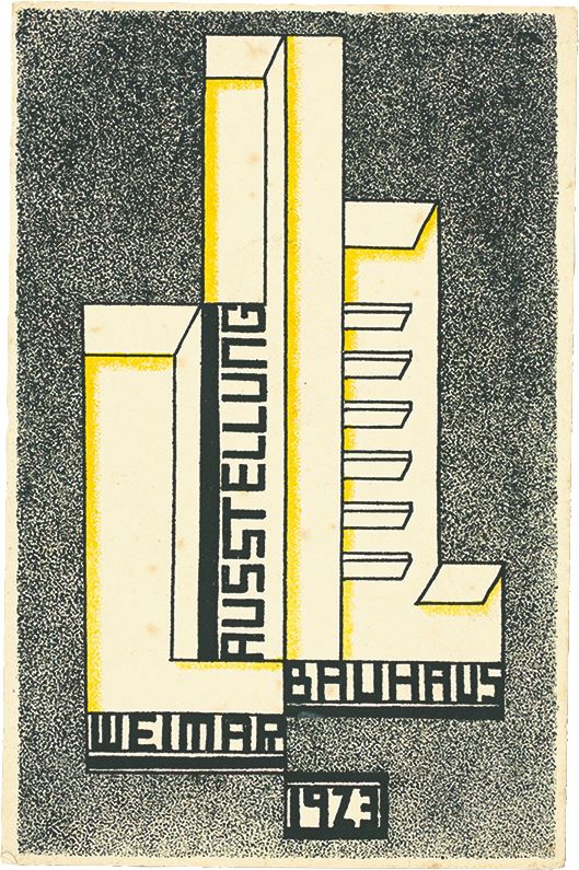
Geometric form, asymmetrical organization and economical typography make communication feel constructed and purposeful.
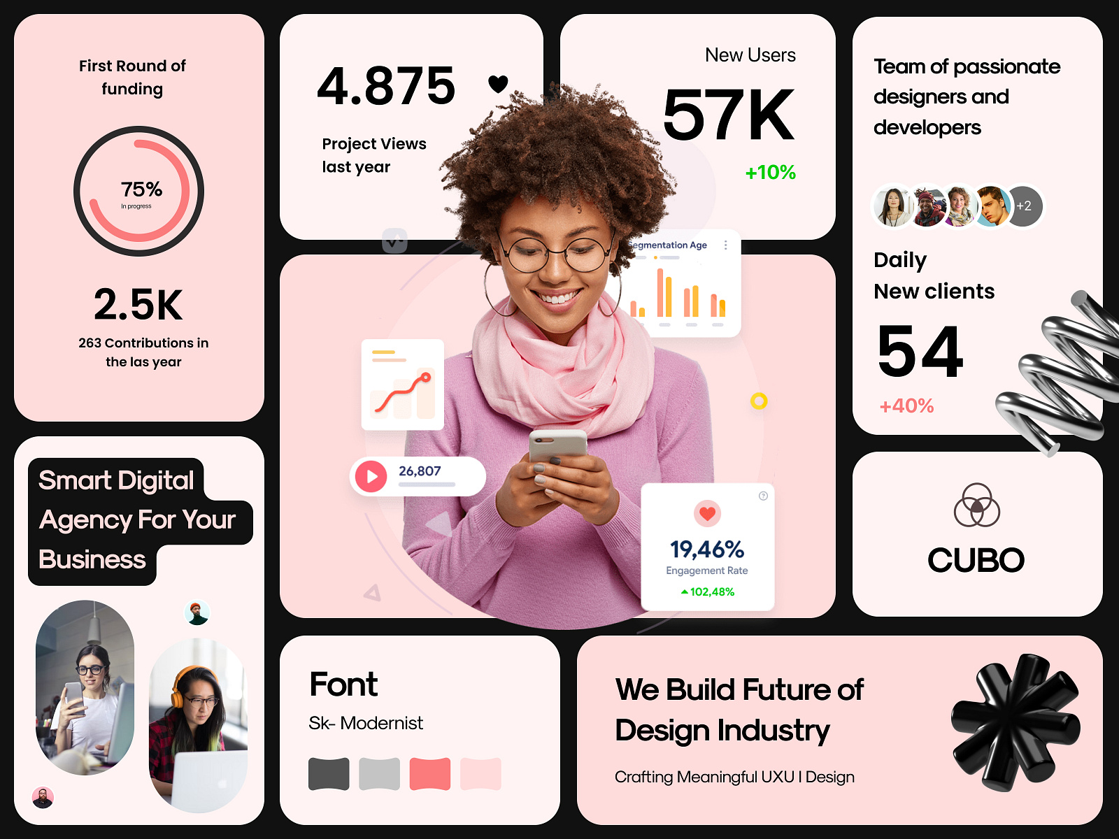
Content is split into rounded tiles of different sizes, packed into one tidy grid like a bento box.
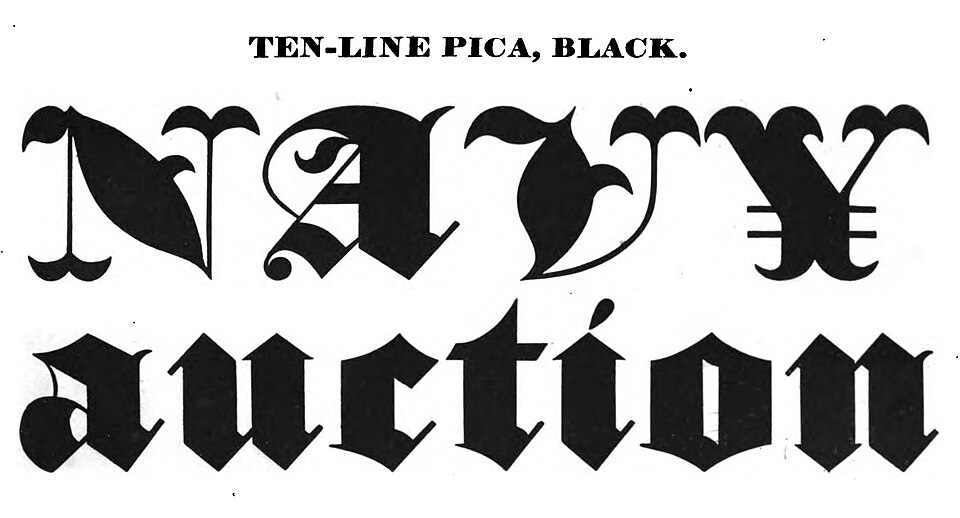
Dense, broken letterforms create a dark typographic texture with sharply differentiated strokes.

Exposed structure, blunt typography and deliberately plain controls give the interface a direct, unvarnished character.

Multiple lithographic color passes combine to reproduce richly colored illustration.

Rounded, inflated shapes with soft inner and outer shadows make interface elements look like pressed clay.
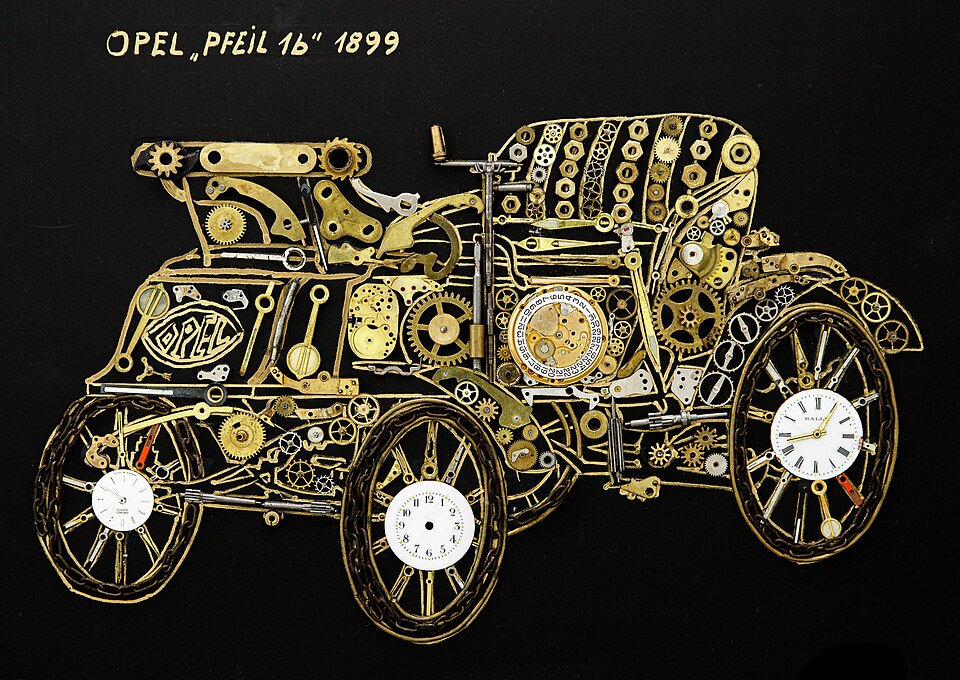
Separate materials or image fragments retain their edges while forming a new composition.
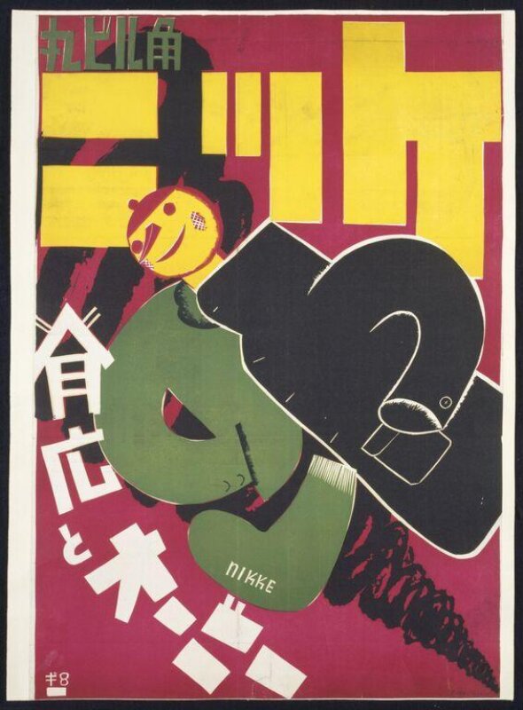
Heavy typography, diagonals and geometric structures make a page feel active and forceful.
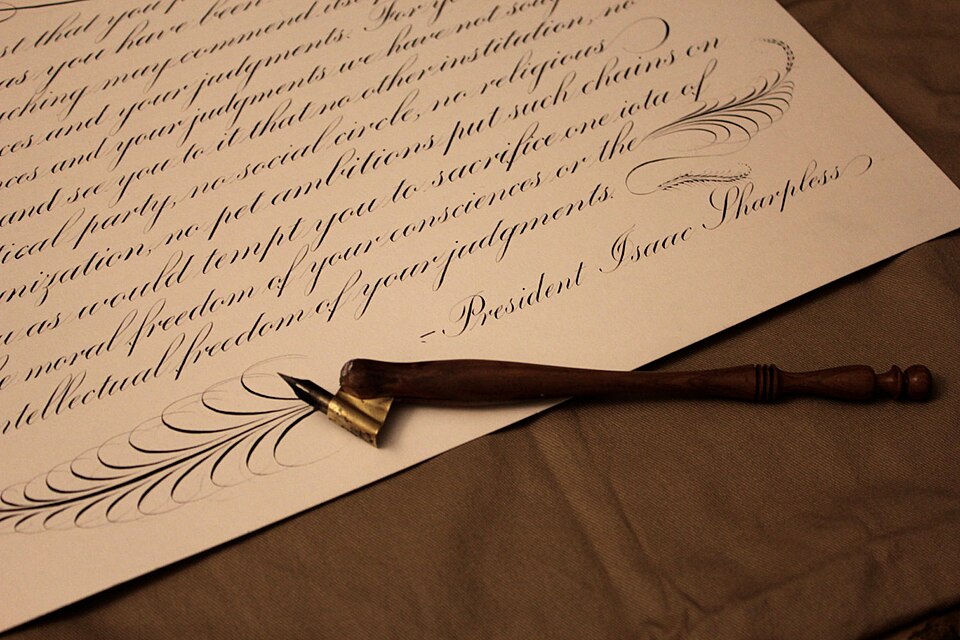
Slender connecting strokes and swelling curves produce a flowing, highly controlled writing rhythm.

Simplified figures and large flat shapes create friendly, approachable scenes with little surface detail.
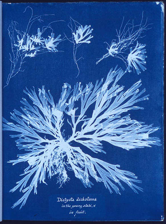
Light silhouettes against a deep blue field emphasize contact, exposure and the shape of an object.

Digital grids, neon light and computer imagery build a future imagined through technology.
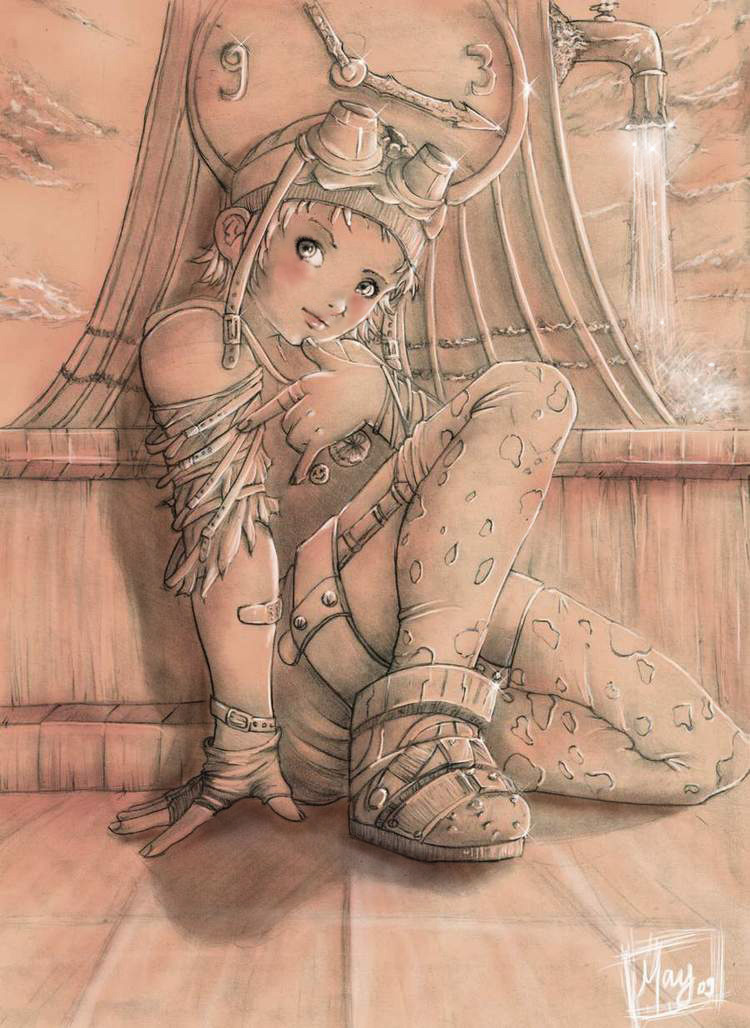
Dense technological environments combine luminous interfaces, urban texture and a sense of friction or decay.
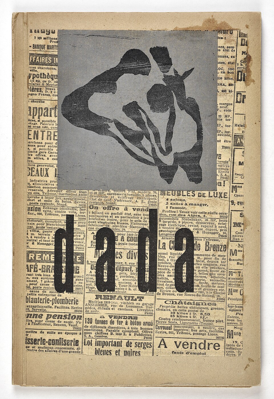
Disjointed type, found material and abrupt changes in scale interrupt ordinary reading and visual expectation.
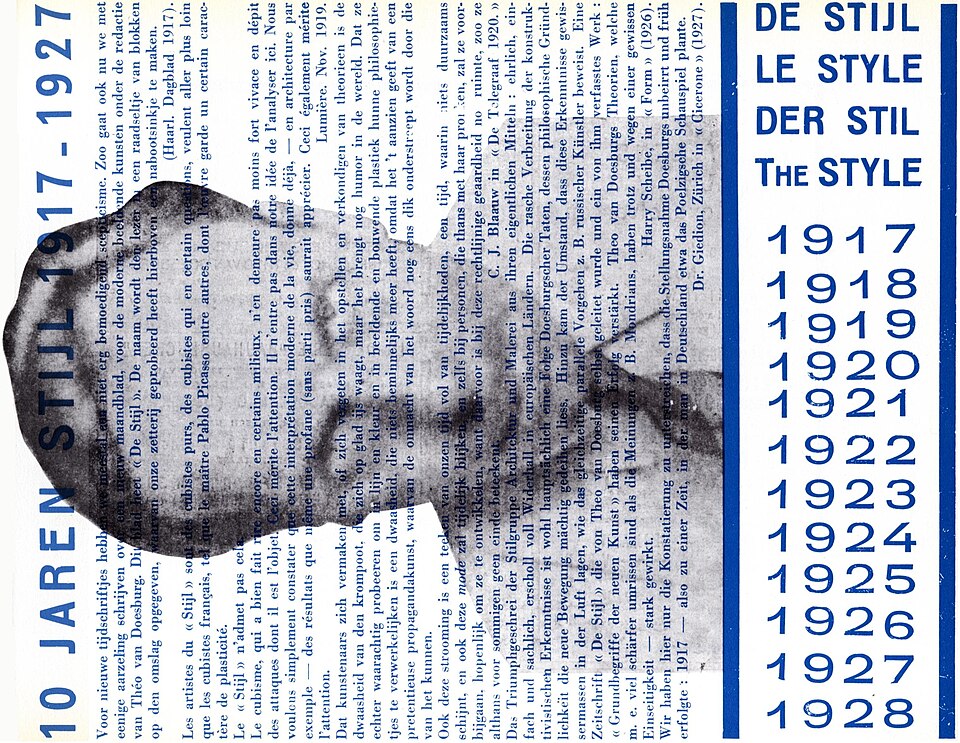
Horizontal and vertical relationships organize flat geometric fields into an asymmetrical equilibrium.
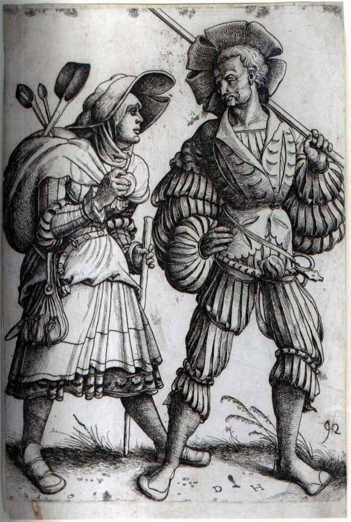
Fine incised lines and layered hatching build tone through a dense, tactile drawing surface.
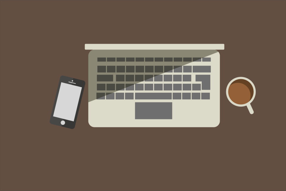
Simple silhouettes and clear color separation reduce the appearance of physical depth.

Glossy, translucent surfaces combine idealized nature with a clean, optimistic digital atmosphere.
Explosive typography and competing directional forces turn text into a visual expression of motion.

Translucent, blurred panels float above colorful backgrounds like sheets of frosted glass.
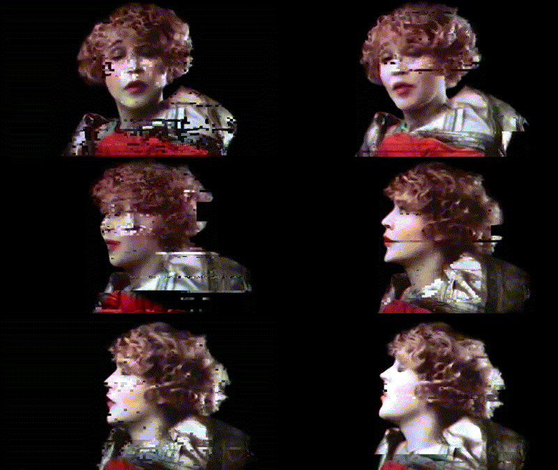
Displacement, corruption and interrupted repetition make the image appear to malfunction.

Eroded letterforms and unstable spacing give type a worn, abrasive and imperfect surface.
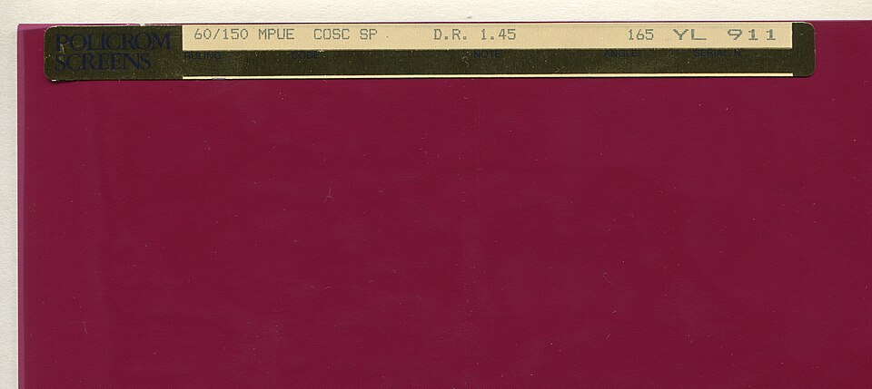
A regular field of marks translates continuous tone into a printable pattern.
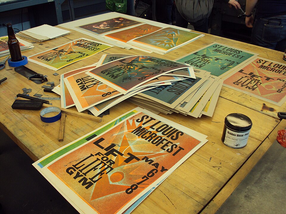
Pressure and raised printing surfaces produce crisp edges, ink variation and sometimes a visible impression.

Even outlines and clean color areas keep figures and environments equally readable.
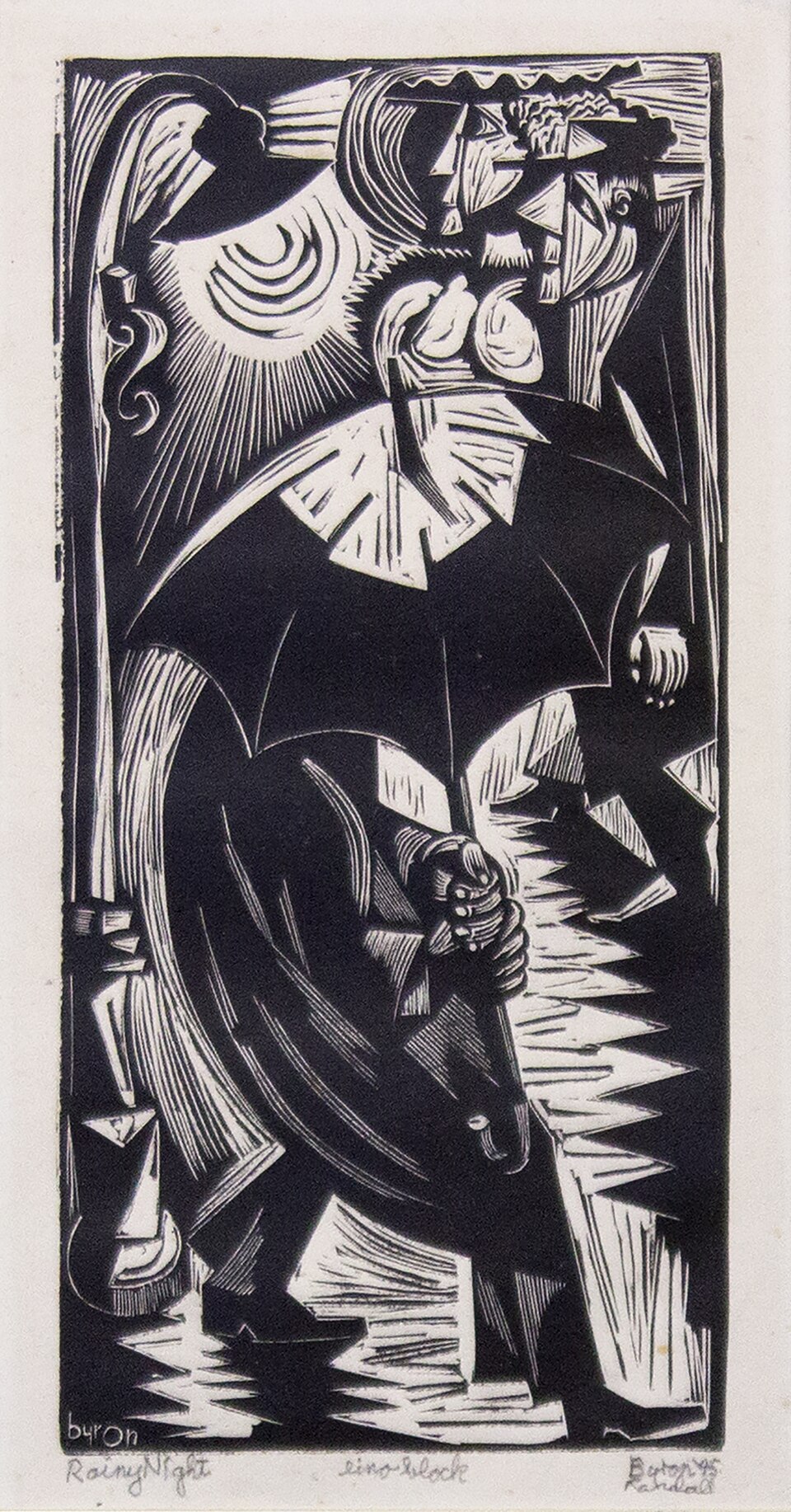
Cut marks and broad printed shapes make a composition feel direct and tactile.
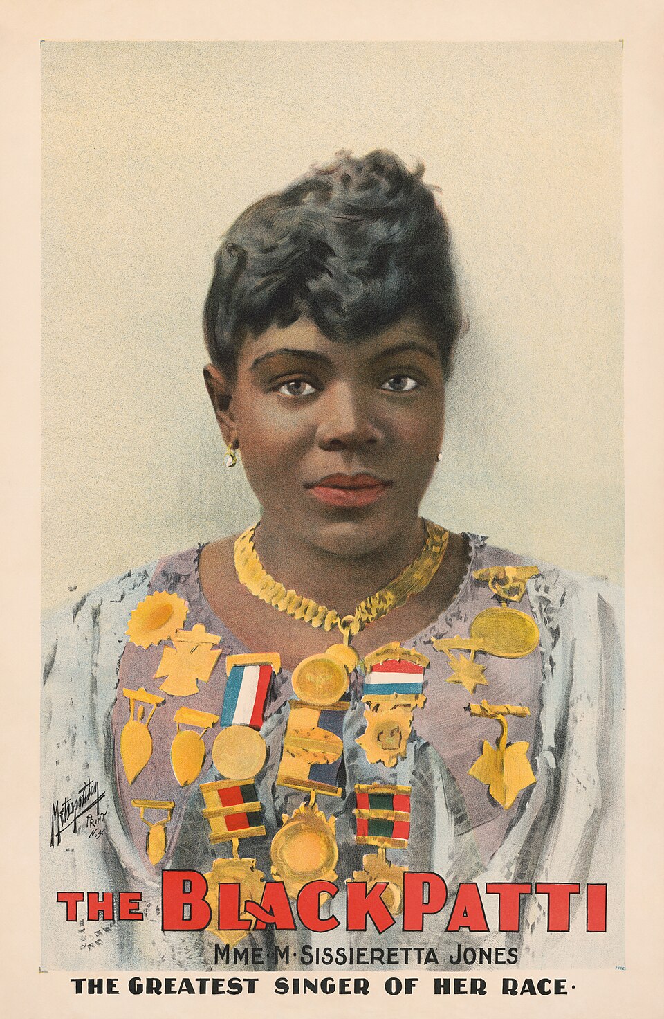
A drawn image can retain fluid lines and tonal variety when reproduced from a prepared flat surface.

Abundant pattern, layered references and competing scales create a deliberately full visual field.
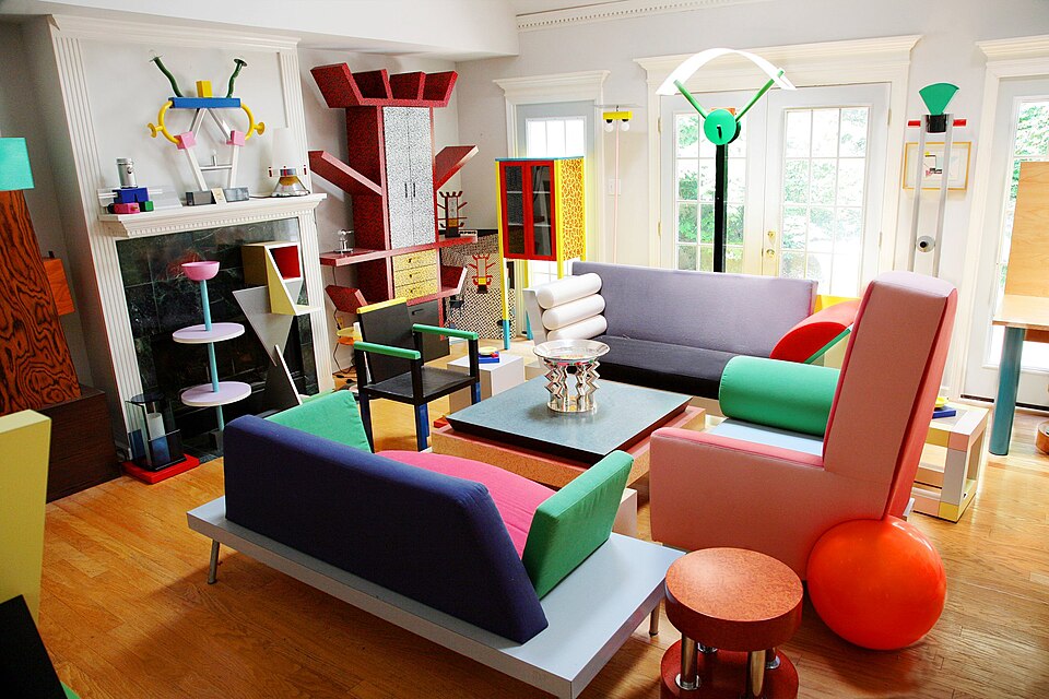
Playful geometry, surface pattern and unexpected proportions deliberately unsettle conventional visual order.

Economical shapes and expressive composition balance a clean structure with warmth and visual wit.

Reduction concentrates attention on a few elements, their proportions and the space between them.

Thick black outlines, hard offset shadows and flat bright colors give an interface a bold, deliberately blunt look.
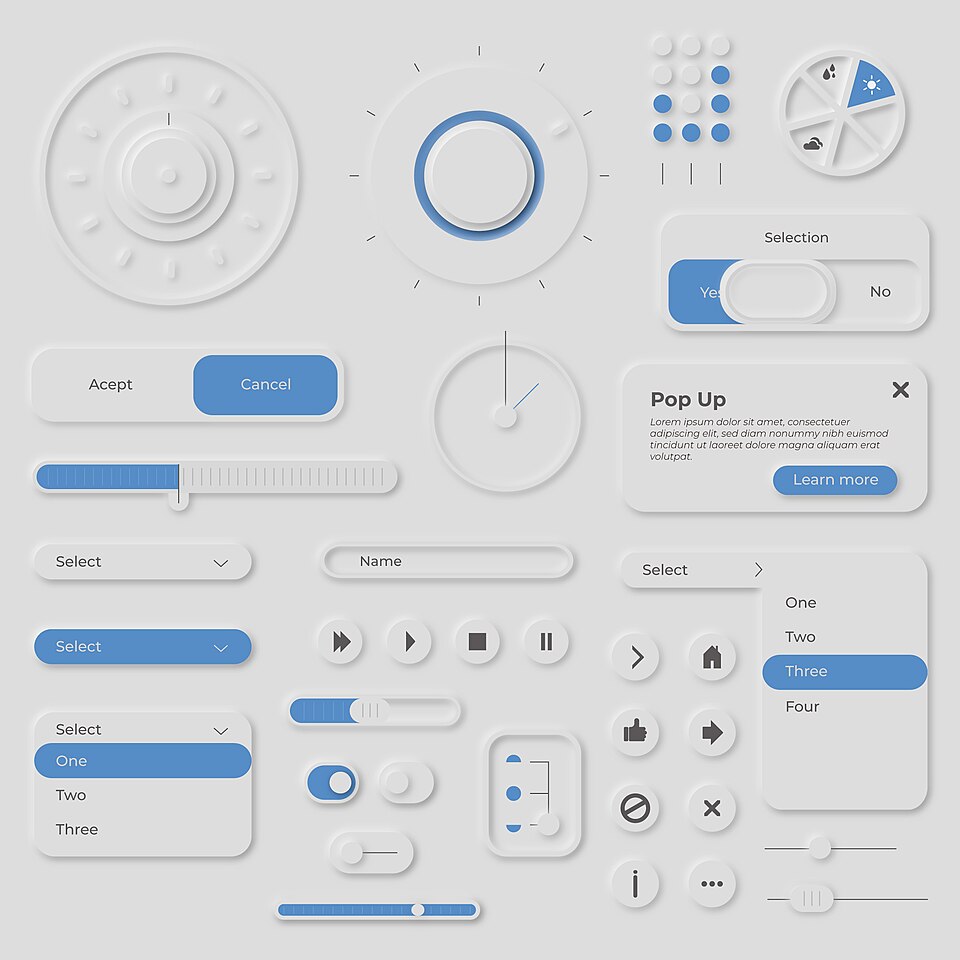
Controls seem pressed out of, or into, one soft surface through paired light and dark shadows.

Asymmetry, directional relationships and clear typographic contrast organize the page around communication.

A disciplined typographic foundation is stretched through layering, altered spacing and unconventional reading paths.

Repeated geometric relationships make a static surface appear to vibrate, shift or recede.
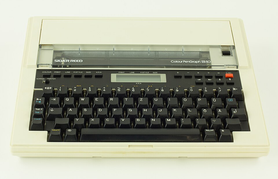
Continuous paths and repeated strokes expose the logic of a drawing machine.
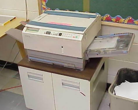
High-contrast reproduction, grain and repeated degradation create a rough documentary surface.
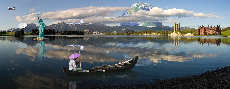
Photographic fragments are combined to create an image that a single camera exposure would not produce.

Discrete pixel placement defines contours, texture and shading at a deliberately limited resolution.

A reduced object and a commanding name make the advertising message immediately recognizable.

Bold outlines, repetition and familiar commercial imagery give the image an immediate, graphic impact.

Layered references, expressive typography and visible contradictions challenge the idea of a neutral visual language.

Interlocking shapes and vibrating color relationships produce an immersive, visually unstable field.

Cut lettering, rough reproduction and abrupt juxtaposition create an urgent, improvised visual voice.
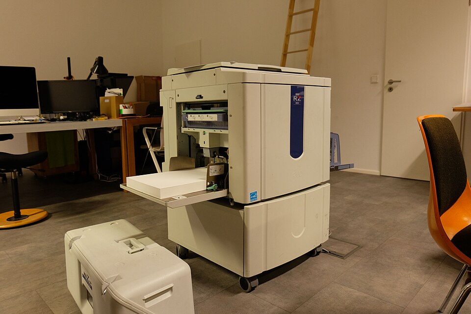
Spot-color layers and small variations in registration produce vivid, tactile printed surfaces.
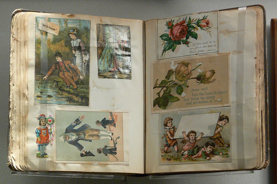
Photos, paper scraps, tape and handwritten notes are layered as if pasted into a personal album.
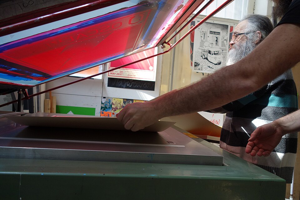
Separate ink passes produce strong silhouettes, opaque color and purposeful overlap.

Familiar materials and object-like controls help a digital surface suggest its physical function.

Idealized figures, emphatic scale and clear narrative framing make a political or civic message immediately legible.

Long horizontal movement and rounded, aerodynamic forms give objects and compositions a sense of flow.

Flattened space and crisply bounded forms place characters, pattern and surface on a shared plane.
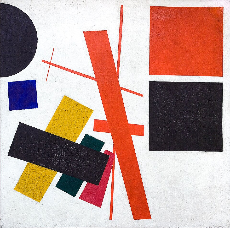
Elementary geometric forms float in open space, with balance produced through position, angle and scale.
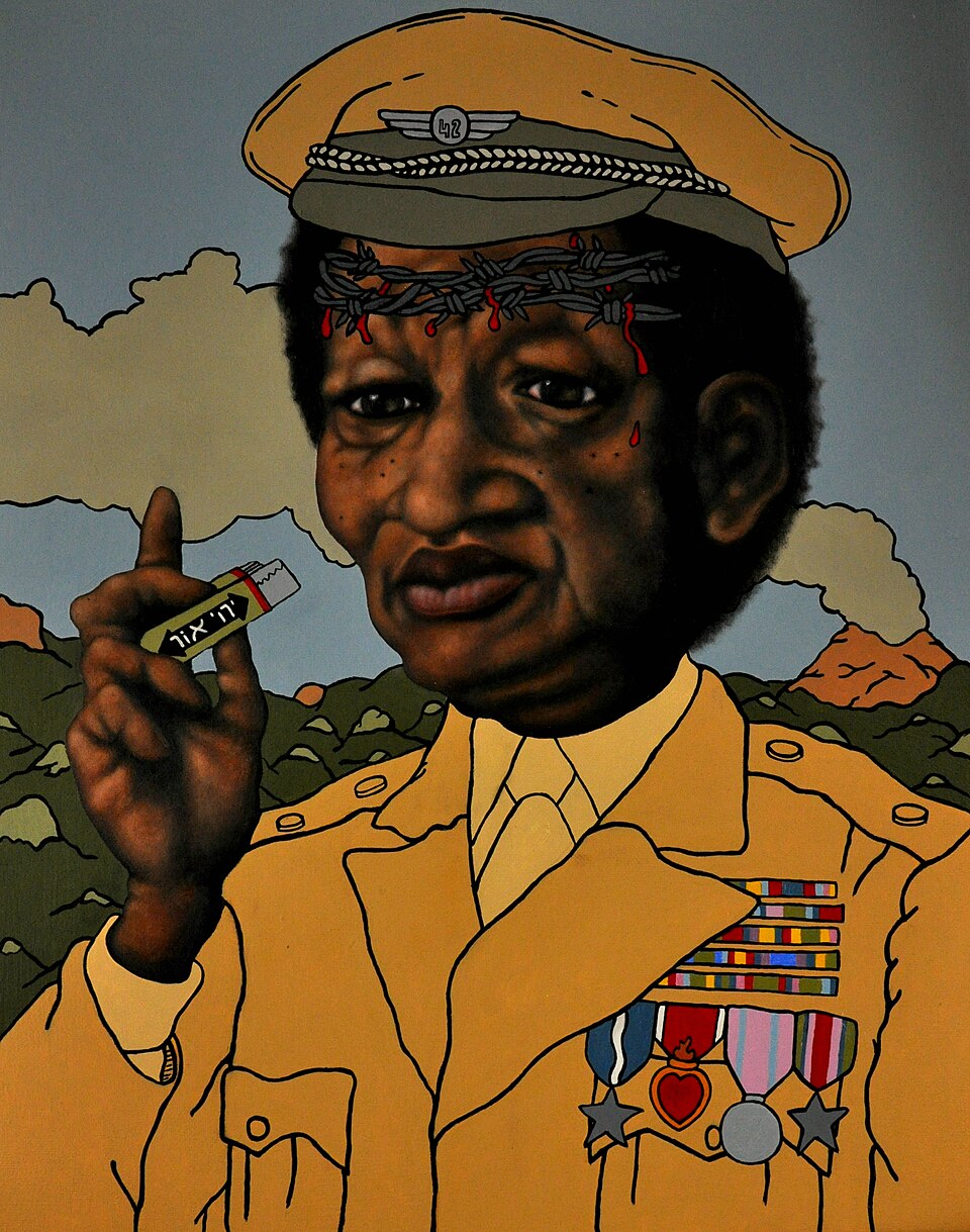
Unexpected relationships between familiar things make the image feel dreamlike, impossible or psychologically charged.
A precise grid, asymmetrical balance and economical typography give complex information a clear visual order.
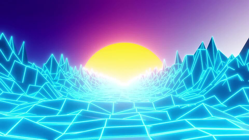
Luminous horizons, reflective surfaces and receding grids build a stylized electronic atmosphere.

Clear contour, patterned surfaces and cropped compositions create a strong relationship between figure and surrounding space.
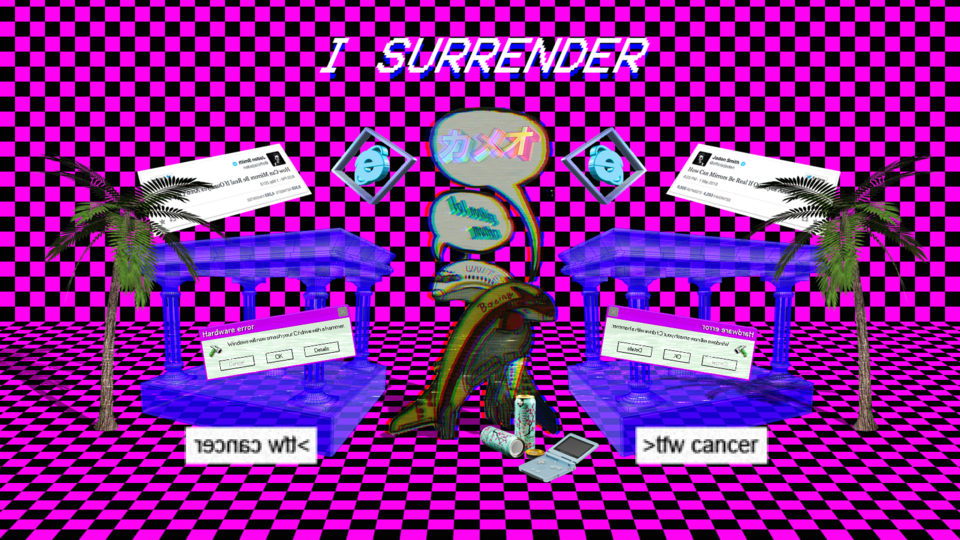
Detached commercial imagery, artificial surfaces and disrupted digital space create an atmosphere of mediated nostalgia.

Ornate lettering, detailed illustration and layered framing create a rich commercial page.
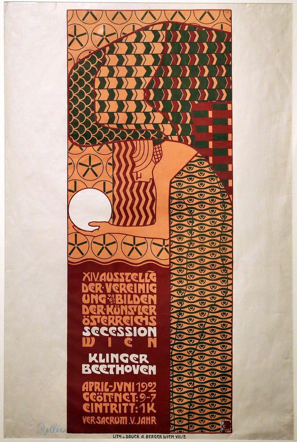
Stylized ornament and geometric discipline bring decorative surfaces into tension with structural order.
Muted natural materials, asymmetry and visible wear express a quiet beauty in imperfection.
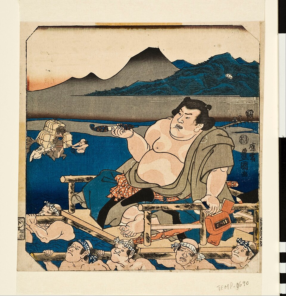
Carved lines and printed solid areas turn the contrast between ink and paper into an expressive surface.

Reduced illustration and clearly organized lettering turn civic messages into direct, accessible posters.

Glossy surfaces, synthetic forms and compact digital typography evoke an imagined technological future.
Try a broader search or remove a filter.