Movementc. 1919–1933
Bauhaus
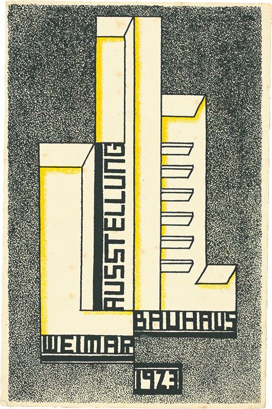
Geometric form, asymmetrical organization and economical typography make communication feel constructed and purposeful.
Primary geometric shapes
Asymmetry, directional relationships and clear typographic contrast organize the page around communication.
The New Typography was a graphic design movement based in the Weimar Republic, defined in 1928 by the typographer Jan Tschichold in his book Die Neue Typographie. It rejected the traditional arrangement of type in favour of asymmetry, sans-serif letterforms and the active combination of photography and text, applied to posters, advertisements, business cards, stationery and brochures. Its participants included El Lissitzky, Kurt Schwitters, László Moholy-Nagy and Aleksandr Rodchenko, who held that graphic design could change society and convey the dynamism of modern life.
Historical context draws on the supplied research. Approximate periods are reference ranges, not fixed boundaries. See the source notes below.
Build hierarchy from alignment, size and weight before adding decoration.
Do not mistake a single sans-serif face for an entire typographic system.
Geometric form, asymmetrical organization and economical typography make communication feel constructed and purposeful.

A precise grid, asymmetrical balance and economical typography give complex information a clear visual order.