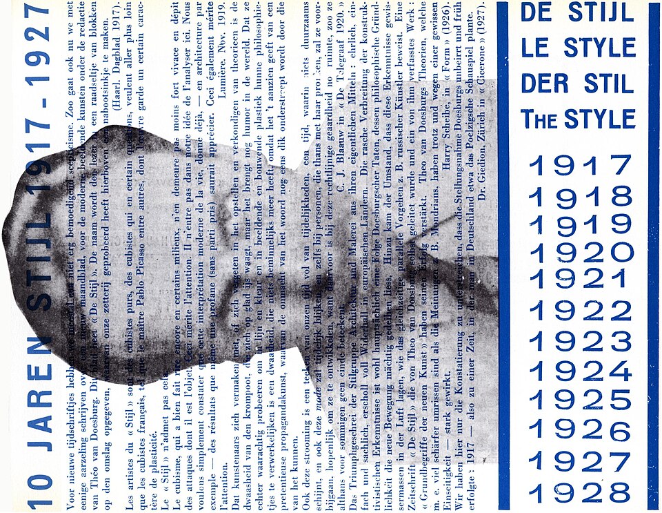
Movementc. 1917–1931
De Stijl
Horizontal and vertical relationships organize flat geometric fields into an asymmetrical equilibrium.
Orthogonal divisions
Geometric form, asymmetrical organization and economical typography make communication feel constructed and purposeful.
The Bauhaus was a school whose teaching joined art, craft and design through several changing programs. Its graphic work explored geometric typography, photography and asymmetrical organization. The institution’s three directors were Walter Gropius, Hannes Meyer and Ludwig Mies van der Rohe. Moholy-Nagy contributed as a teacher, not as a director of the German Bauhaus.
Walter Gropius · Hannes Meyer · Ludwig Mies van der Rohe · Herbert Bayer · László Moholy-Nagy · Joost Schmidt
Historical context draws on the supplied research. Approximate periods are reference ranges, not fixed boundaries. See the source notes below.
Choose a small vocabulary of shapes and make every placement serve hierarchy.
The school cannot be reduced to circles, triangles and primary colors.
Horizontal and vertical relationships organize flat geometric fields into an asymmetrical equilibrium.

Asymmetry, directional relationships and clear typographic contrast organize the page around communication.