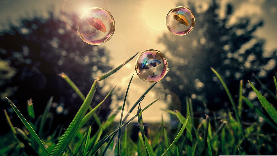
AestheticUndated
Frutiger Aero
Glossy, translucent surfaces combine idealized nature with a clean, optimistic digital atmosphere.
Glass-like panels
Translucent, blurred panels float above colorful backgrounds like sheets of frosted glass.
Glassmorphism is a visual design style that imitates frosted glass, using varying degrees of translucency to separate foreground elements from the background and suggest depth. According to Nielsen Norman Group, it has been gaining popularity since 2020 and features prominently in the design systems of Apple and Microsoft. Its main ingredients are reduced opacity and background blur, often refined with strokes and gradients. Used carefully it can build hierarchy, but overuse can create accessibility and usability problems.
Historical context draws on the supplied research. Approximate periods are reference ranges, not fixed boundaries. See the source notes below.
Test text contrast over the brightest and darkest parts of the background.
Blur alone is not a hierarchy; many stacked glass layers become muddy.
Glossy, translucent surfaces combine idealized nature with a clean, optimistic digital atmosphere.

Simple silhouettes and clear color separation reduce the appearance of physical depth.
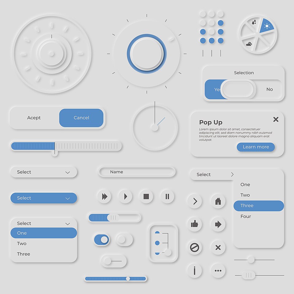
Controls seem pressed out of, or into, one soft surface through paired light and dark shadows.