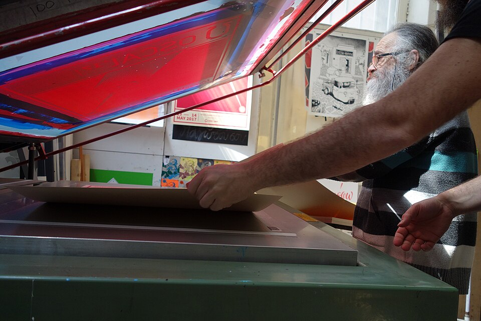
TechniqueUndated
Screen printing
Separate ink passes produce strong silhouettes, opaque color and purposeful overlap.
Flat ink areas
Spot-color layers and small variations in registration produce vivid, tactile printed surfaces.
The Risograph is a stencil-based printer that makes a master stencil and prints from it within one machine, lowering printing costs. It was developed in the 1980s by the Japanese company Riso Kagaku, which Noboru Hayama founded in 1946. Although artists and designers around the world have adopted it for its analogue character, including the scratches and small variations that make each print distinct, most of its use in Japan remains low-cost printing for schools, hospitals and government offices.
Historical context draws on the supplied research. Approximate periods are reference ranges, not fixed boundaries. See the source notes below.
Plan overlapping inks as a third visual relationship.
A digital misregistration effect is a simulation, not evidence of a printed original.
Separate ink passes produce strong silhouettes, opaque color and purposeful overlap.
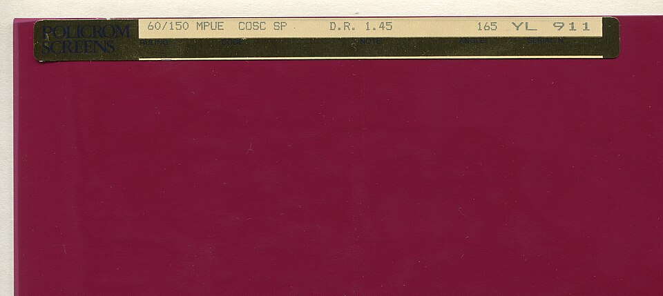
A regular field of marks translates continuous tone into a printable pattern.