TechniqueUndated
Screen printing
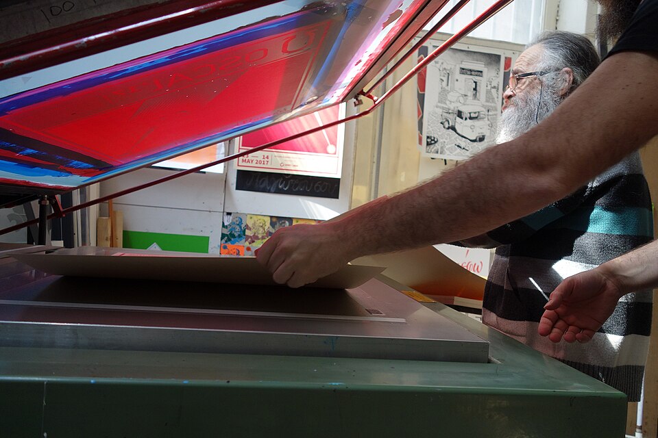
Separate ink passes produce strong silhouettes, opaque color and purposeful overlap.
Flat ink areas
A regular field of marks translates continuous tone into a printable pattern.
Halftone is a method for reproducing continuous-tone artwork on printing presses that can apply only a single solid colour of ink per plate. When the image was photographed onto film, a fine screen of perpendicular intersecting lines was set between the film and the original, breaking the picture into thousands of tiny dots. The dots are larger and closer together in dark areas and smaller and farther apart in light ones, so the eye perceives smooth gradations of tone rather than individual dots.
Historical context draws on the supplied research. Approximate periods are reference ranges, not fixed boundaries. See the source notes below.
Check the pattern at its final display size and resolution.
Rescaling can create moiré or destroy the intended dot structure.
Separate ink passes produce strong silhouettes, opaque color and purposeful overlap.

Bold outlines, repetition and familiar commercial imagery give the image an immediate, graphic impact.