AestheticUndated
Frutiger Aero
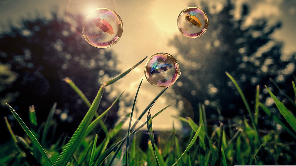
Glossy, translucent surfaces combine idealized nature with a clean, optimistic digital atmosphere.
Glass-like panels
Glossy surfaces, synthetic forms and compact digital typography evoke an imagined technological future.
The Y2K aesthetic is a design style tied to the turn of the millennium, spanning the late 1990s and early 2000s. It is known for rounded, inflated typefaces and a hyper-digital finish of metallic, glossy, mirrored and 3D surfaces, along with interface cues such as loading bars and rendered buttons. Holographic gradients, iridescent colours and shiny silver are among its most recognisable traits, reflecting enthusiasm for new technology at the time.
Historical context draws on the supplied research. Approximate periods are reference ranges, not fixed boundaries. See the source notes below.
Choose between glossy futurism and utilitarian interface references before combining them.
The label covers multiple visual tendencies rather than one consistent system.
Glossy, translucent surfaces combine idealized nature with a clean, optimistic digital atmosphere.

Dense technological environments combine luminous interfaces, urban texture and a sense of friction or decay.