Letterform1050
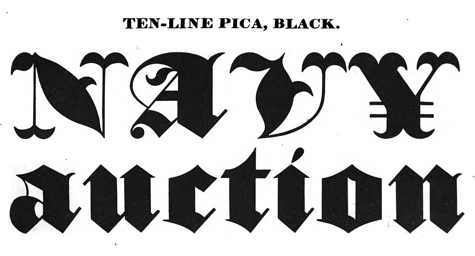
Blackletter
Dense, broken letterforms create a dark typographic texture with sharply differentiated strokes.
Angular joins
Slender connecting strokes and swelling curves produce a flowing, highly controlled writing rhythm.
Copperplate, also known as Round Hand, is a style of lettering refined by European penmen and engravers during the seventeenth and eighteenth centuries and written with a flexible nib. Pressing on the downstroke spreads the nib to make a thick line, while easing off on the upstroke leaves a fine hairline, and letters lean 45 to 55 degrees from the baseline. Early writers used swan and goose quills, and metal nibs arrived in the eighteenth century. In New South Wales schools, Round Hand was required from 1880 until cursive replaced it in 1925.
Historical context draws on the supplied research. Approximate periods are reference ranges, not fixed boundaries. See the source notes below.
Allow space for ascenders and flourishes; pair with a restrained text face.
Small reproduction can erase hairlines and close delicate counters.
Dense, broken letterforms create a dark typographic texture with sharply differentiated strokes.