LetterformUndated
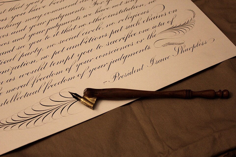
Copperplate script
Slender connecting strokes and swelling curves produce a flowing, highly controlled writing rhythm.
Slanted letterforms
Dense, broken letterforms create a dark typographic texture with sharply differentiated strokes.
Blackletter, often popularly called Gothic, began as a medieval book hand of the Gothic script family, known as Textualis or Textura, and was later turned into typefaces that remain in use in calligraphy and typesetting. The script arose in the late twelfth century and was used across Western Europe until around the seventeenth century. Johannes Gutenberg cut a textualis type, rich in ligatures and abbreviations, for his 42-line Bible. The Fraktur variant became the most common German blackletter by the middle of the sixteenth century.
Historical context draws on the supplied research. Approximate periods are reference ranges, not fixed boundaries. See the source notes below.
Use generous scale and test the specific words for legibility.
Blackletter is a family of letterform traditions, not one font or one ideology.
Slender connecting strokes and swelling curves produce a flowing, highly controlled writing rhythm.
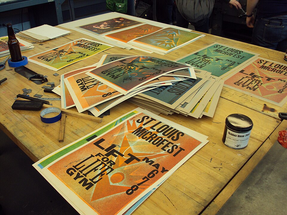
Pressure and raised printing surfaces produce crisp edges, ink variation and sometimes a visible impression.