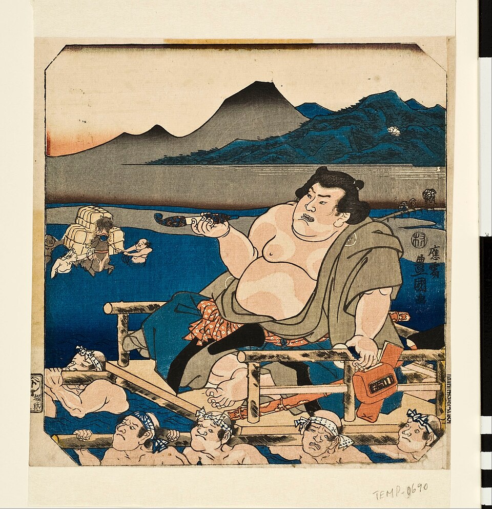
TechniqueUndated
Woodcut
Carved lines and printed solid areas turn the contrast between ink and paper into an expressive surface.
Strong cut contours
Pressure and raised printing surfaces produce crisp edges, ink variation and sometimes a visible impression.
Letterpress is a printing process in which raised surfaces, typically of wood, metal or linoleum, are inked and pressed onto paper. It is essentially the relief printing method invented by Johannes Gutenberg in the fifteenth century, using movable type, hand-carved blocks and hand-cranked presses. Carved blocks and movable letters are set in reverse, locked into a frame called a chase, inked and printed so the impression reads correctly. Each additional colour requires its own assembled form and a separate pass through the press.
Historical context draws on the supplied research. Approximate periods are reference ranges, not fixed boundaries. See the source notes below.
Design for the actual paper, type size and intended printing pressure.
Deep debossing is one treatment, not a defining requirement for all letterpress.
Carved lines and printed solid areas turn the contrast between ink and paper into an expressive surface.
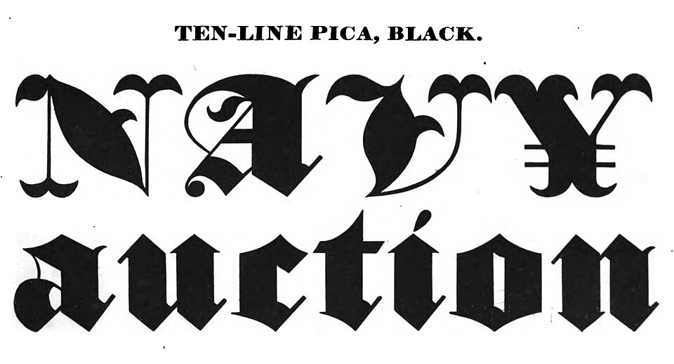
Dense, broken letterforms create a dark typographic texture with sharply differentiated strokes.