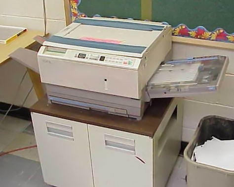
ApparatusUndated
Photocopier
High-contrast reproduction, grain and repeated degradation create a rough documentary surface.
Crushed shadows
Cut lettering, rough reproduction and abrupt juxtaposition create an urgent, improvised visual voice.
Punk graphics are the flyers, posters, album covers, promotional material, zines and related ephemera produced around punk and post-punk music, surveyed in an exhibition covering 1976 to 1986 that included material from New York's CBGB scene. Designers relied on strategies such as parody, pastiche, appropriation and collage, and drew on science fiction, horror and comics. Over the decade the look shifted from spare black-and-white minimalism toward the broader colour and expressive forms of New Wave graphics.
Historical context draws on the supplied research. Approximate periods are reference ranges, not fixed boundaries. See the source notes below.
Make the hierarchy blunt enough to survive rough reproduction.
Do not turn the signs of low-budget making into meaningless decoration.
High-contrast reproduction, grain and repeated degradation create a rough documentary surface.
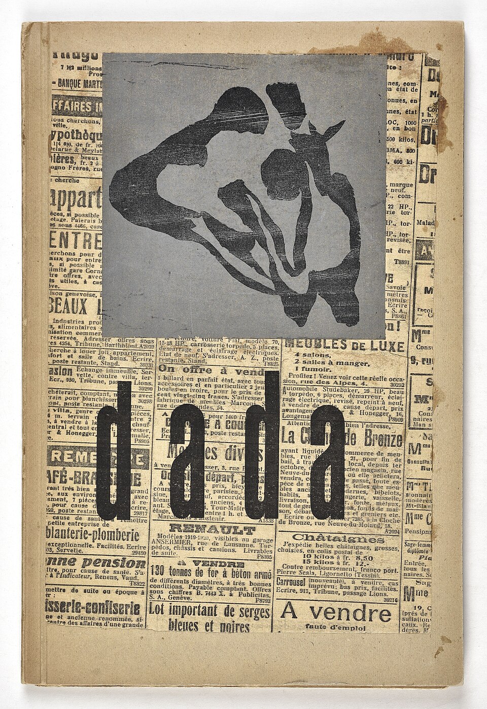
Disjointed type, found material and abrupt changes in scale interrupt ordinary reading and visual expectation.