MovementUndated
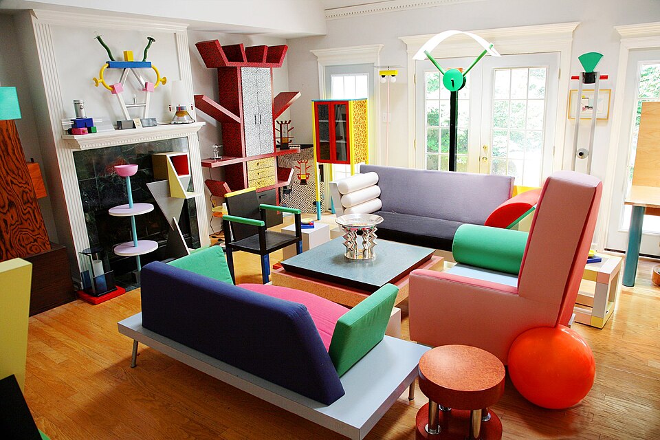
Memphis
Playful geometry, surface pattern and unexpected proportions deliberately unsettle conventional visual order.
Squiggles and pattern
Abundant pattern, layered references and competing scales create a deliberately full visual field.
Maximalism in graphic design is an aesthetic of excess, framed as a reaction against minimalism. It relies on bold colours, patterns, textures, layering, repetition, intricate detail, serif type and ornament, leaves little or no white space, and freely mixes elements that would not sit together in a minimalist layout. The column traces its roots to advertising trade cards, which date from the 1700s and multiplied with colour lithography in the 1870s, and links it to horror vacui, the fear of empty space. It names Peter Max, David Carson and Stefan Sagmeister as contemporary maximalists.
Historical context draws on the supplied research. Approximate periods are reference ranges, not fixed boundaries. See the source notes below.
Give the composition a dominant anchor so abundance remains navigable.
Maximum quantity without hierarchy becomes accidental clutter.
Playful geometry, surface pattern and unexpected proportions deliberately unsettle conventional visual order.

Interlocking shapes and vibrating color relationships produce an immersive, visually unstable field.