AestheticUndated
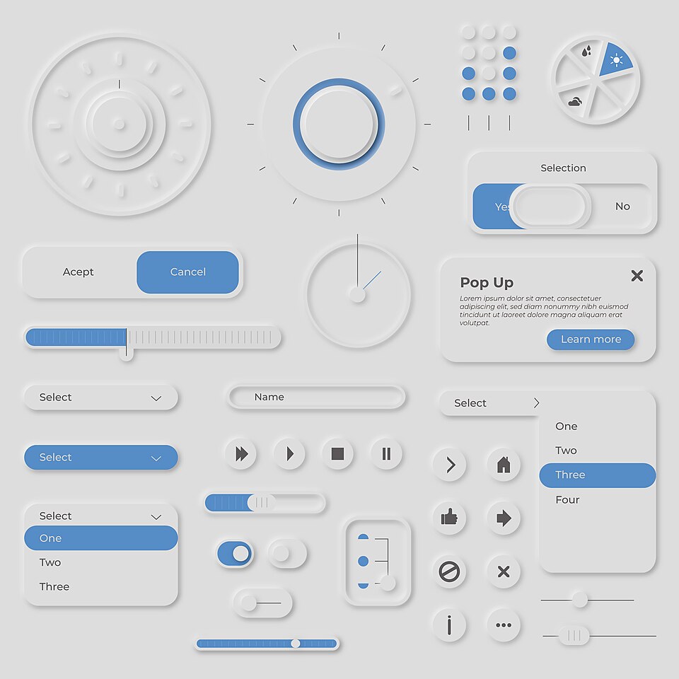
Neumorphism
Controls seem pressed out of, or into, one soft surface through paired light and dark shadows.
Same-color surfaces
Rounded, inflated shapes with soft inner and outer shadows make interface elements look like pressed clay.
Claymorphism is a user interface design trend that gives elements a soft, inflated three-dimensional look. A 2022 Smashing Magazine article credits the term to Michal Malewicz, who had also been behind the earlier neumorphism trend. The effect is built from two inner shadows, one dark and one light, plus a usually darker outer shadow, which together make elements appear soft and floating. Unlike neumorphism, it can be used on any background color, easing that style's problems with visual hierarchy and contrast.
Historical context draws on the supplied research. Approximate periods are reference ranges, not fixed boundaries. See the source notes below.
Keep text on plain, high-contrast surfaces rather than on shaded forms.
Soft, low-contrast shadows can hide which elements are interactive.
Controls seem pressed out of, or into, one soft surface through paired light and dark shadows.

Familiar materials and object-like controls help a digital surface suggest its physical function.