AestheticUndated
Frutiger Aero
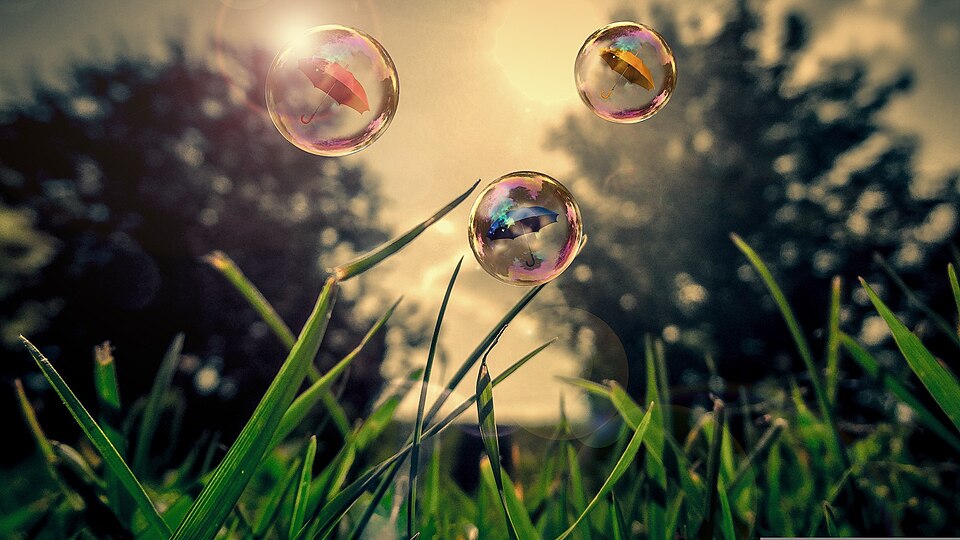
Glossy, translucent surfaces combine idealized nature with a clean, optimistic digital atmosphere.
Glass-like panels
Familiar materials and object-like controls help a digital surface suggest its physical function.
Skeuomorphism is a design practice that brings real-world elements into digital interfaces so that new interfaces feel familiar; the term can mean either a functional learning aid or a visual trend of unnecessary real-world detail. The trend grew in the early 2000s and peaked in the early 2010s, with interfaces using realistic textures, shadows and gradients for a three-dimensional effect, such as wooden bookshelves in an e-reader or leather-bound notepads. Its excesses came to seem cluttered and dated, and flat design emerged in response.
Historical context draws on the supplied research. Approximate periods are reference ranges, not fixed boundaries. See the source notes below.
Use physical cues only when they help explain an interaction.
Decorative realism can introduce misleading affordances.
Glossy, translucent surfaces combine idealized nature with a clean, optimistic digital atmosphere.

Simple silhouettes and clear color separation reduce the appearance of physical depth.