
Stylec. 1968–1989
New Wave typography
A disciplined typographic foundation is stretched through layering, altered spacing and unconventional reading paths.
Expanded letterspacing
Layered references, expressive typography and visible contradictions challenge the idea of a neutral visual language.
Postmodern graphic design questioned the authority of a single neutral or universal visual language. Historical quotation, layered imagery and expressive typography could make the act of interpretation visible. It is a broad critical category; New Wave typography and grunge have separate entries to preserve their different formal characteristics.
Wolfgang Weingart · April Greiman · Katherine McCoy · Dan Friedman · David Carson · Neville Brody
Historical context draws on the supplied research. Approximate periods are reference ranges, not fixed boundaries. See the source notes below.
Use disruption to reveal a second meaning while preserving an entry point.
New Wave, grunge and postmodernism overlap but should not be treated as synonyms.
A disciplined typographic foundation is stretched through layering, altered spacing and unconventional reading paths.
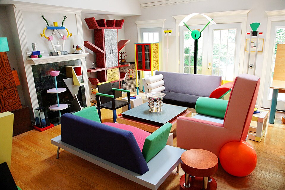
Playful geometry, surface pattern and unexpected proportions deliberately unsettle conventional visual order.