TechniqueUndated
Screen printing
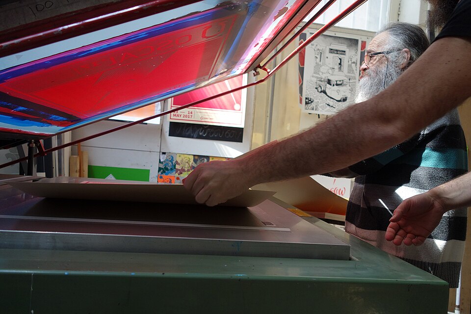
Separate ink passes produce strong silhouettes, opaque color and purposeful overlap.
Flat ink areas
Reduced illustration and clearly organized lettering turn civic messages into direct, accessible posters.
Posters produced by branches of the Works Progress Administration advertised public programs, exhibitions, health messages and civic destinations. The Library of Congress collection covers work from 1936 to 1943. These posters show varied approaches rather than a single mandated style; flat shapes and economical color separation are especially useful visual points of comparison.
Anthony Velonis · Richard Floethe
Historical context draws on the supplied research. Approximate periods are reference ranges, not fixed boundaries. See the source notes below.
Organize one clear civic message around a strong silhouette.
The WPA was a program with varied work, not a single uniform aesthetic.
Separate ink passes produce strong silhouettes, opaque color and purposeful overlap.

Geometric ornament and stylized volume give the page a monumental, carefully staged presence.