AestheticUndated
Glitch art
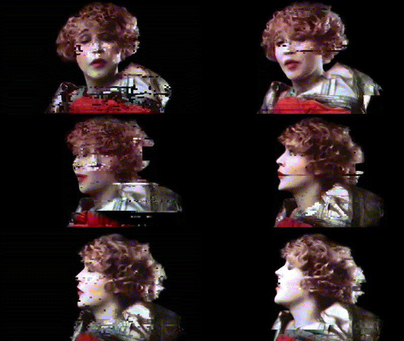
Displacement, corruption and interrupted repetition make the image appear to malfunction.
Channel offsets
Distorted lettering, abrasive surfaces and synthetic imagery assembled into deliberately unstable compositions.
Acid graphics is a graphic design trend that revisits psychedelic visual language but treats it with irony and cynicism rather than utopian optimism. It is marked by bright colours, heavy use of neon green, warped or inverted experimental lettering, op-art patterning, sci-fi futurism and organic forms combined with a heavy metal feel. The style borrows from 1990s rave and acid house nightclub posters and from punk's do-it-yourself attitude. It appears mainly on music posters and record sleeves, and also in editorial, branding and digital design.
Historical context draws on the supplied research. Approximate periods are reference ranges, not fixed boundaries. See the source notes below.
Keep practical event details in a clear, separate zone.
A fluorescent palette alone does not create the visual tension.
Displacement, corruption and interrupted repetition make the image appear to malfunction.

Interlocking shapes and vibrating color relationships produce an immersive, visually unstable field.