
AestheticUndated
Flat design
Simple silhouettes and clear color separation reduce the appearance of physical depth.
Solid fills
Simplified figures and large flat shapes create friendly, approachable scenes with little surface detail.
Corporate Memphis is a label for a flat, colourful, minimal illustration style showing energetic figures with long legs, lanky arms and small torsos, used heavily by large technology companies and start-ups. Commentators commonly trace it to Alegria, an illustration system made by the agency Buck and most famously used by Facebook. The article argues that the label is disputed. Some illustrators prefer the neutral term flat art, and collections claiming to show the style disagree widely about what it includes.
Historical context draws on the supplied research. Approximate periods are reference ranges, not fixed boundaries. See the source notes below.
Give gestures and relationships a specific meaning for the message.
Generic characters can make unrelated brands look interchangeable.
Simple silhouettes and clear color separation reduce the appearance of physical depth.
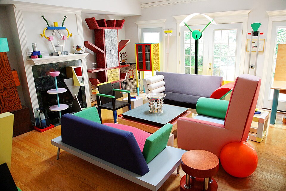
Playful geometry, surface pattern and unexpected proportions deliberately unsettle conventional visual order.